
02, Website UX & design systems
OrganisationAscent
Ascent
Connecting services, stories and careers
A visitor arrives with a business need, not a service name. The site opens with an 'I want to' selector and a How we help route, then connects each capability to customer stories, editorial content and open roles through shared, component-backed sections.
Website UX and design systems · Figma design file and prototype
Project brief
About
Ascent is a software, data and cloud services company. The project covers the corporate website: service pages, customer stories, the Think Tank editorial section, careers and contact, designed as desktop page layouts with mobile layouts for key journeys.
Problem
Services, editorial content and recruitment each pull in a different direction on a corporate site. The design needed one structure that lets a visitor start from a business need and still reach the right capability, example or role.
Objective
Give the site a single navigation and section system, so capability pages, stories and careers share the same building blocks and reading rhythm.
How the interfaces support the task
Prospective client: Start from the homepage 'I want to' selector or How we help, then move into software, insight, data or cloud capability content and the customer stories that sit beside it.
Content reader: Enter Think Tank from the navigation, filter by content type, search, and open a case study or article built from the same editorial section patterns.
Job seeker: Explore the careers overview and filtered job listings on desktop and mobile. The desktop layouts also include an individual job post.
Scope, work needed
- Information architecture across services, How we help, Think Tank, careers, about and contact
- Seventeen desktop page layouts at 1280 width, including Think Tank landing, search, results, case studies and article
- Five mobile layouts at 375 width: homepage, software, careers and two listings layouts
- A shared component set covering foundations, controls, cards, navigation, filters and repeated sections
- A Service Card component set with Software, Insight, Data and Cloud in default and hover states, eight variants
- Prototype states and navigation connecting the main routes through the site
Our contribution
Information architecture for the site, organising services, How we help, Think Tank, careers, about and contact into one navigation model with shared entry points between them.
Page design for seventeen desktop layouts at 1280 width, including the homepage, service pages, How we help, buzz, careers, job listings and post, contact, about and the Think Tank landing, search, results, case studies and article pages.
A shared component library of foundations, controls, cards, navigation, filters and repeated page sections, with production page layouts built from component instances.
A Service Card component set with Software, Insight, Data and Cloud in default and hover states, eight variants in total.
Mobile layouts at 375 width for the homepage, software, careers and two listings pages, adapting the desktop sections to a single column.
An interactive Figma prototype with prototype states and navigation across the main routes through the site.
Design narrative
01Start with a business need
The homepage opens with an 'I want to' selector rather than a service menu. The visitor picks the outcome they are after, and the selector becomes the entry into the capability content behind it.
How we help continues that framing on its own page, moving from purpose, software, data and service to the engagement approach, before naming the specific capabilities.
The homepage opens with an 'I want to' selector, framing the visit as a business need.
How we help guides visitors from purpose to capability, engagement approach and specialisms.
02Connect capabilities to examples
Service content and Think Tank case studies share one editorial structure: a heading, a short introduction, a card grid and a consistent card anatomy of image, type label, date, headline and keyword tags.
Because the structures match, a visitor moving from a capability into a customer story stays in the same reading pattern. The shared structure connects service descriptions with customer examples.
Think Tank case studies: content type tabs, search, a latest row and a filterable grid with pagination.
Card headlines and keyword tags in this layout are placeholder content.
03Give careers a distinct path
Careers has its own route from the homepage and navigation, running through a careers overview into job listings and an individual job post.
The listings layout is designed for mobile as well as desktop: search, filters, a position count and stacked role cards with learn more and apply actions on each entry.
Mobile job listings: search, filters, a position count and role cards with learn more and apply.
The mobile homepage restacks the same sections into one column at 375 width.
04Build the pages from a shared system
The file is organised into foundations, controls, cards, navigation and filters, shared sections, page layouts, prototype states, icons and handoff pages. Production page layouts use instances of those components rather than one-off designs.
The Service Card component set carries Software, Insight, Data and Cloud through default and hover states, eight variants, with the hover state switching to a dark card and an illuminated icon treatment.
Desktop and mobile layouts are paired for the journeys that have both. Not every desktop page has a mobile counterpart in this file.
The Service Card set, four services across default and hover states, eight variants.
Systems & responsive
Design system
A component library of foundations, controls, cards, navigation, filters and repeated sections. The Service Card set covers Software, Insight, Data and Cloud in default and hover states, eight variants, and page layouts are assembled from component instances.
Responsive behaviour
Seventeen desktop page layouts are designed at 1280 width. Five mobile layouts at 375 width cover the homepage, software, careers and two listings pages, restacking the shared sections into a single column. Mobile layouts exist for those journeys only, not for every desktop page.
Prototype
Figma prototype
Explore the main website journeys in the interactive Figma prototype.
Open the design file to inspect shared components, desktop and mobile layouts, and interaction states.
Gallery
9 images
1 / 9
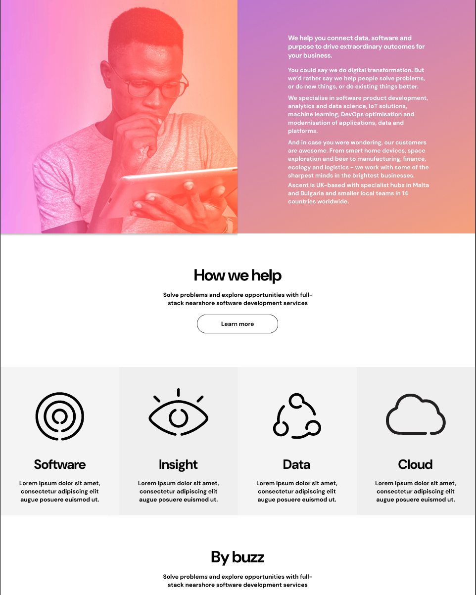
The homepage introduces Ascent before presenting its Software, Insight, Data and Cloud services.
Project notes
Everything shown here comes from the Ascent Figma design file and prototype. Page copy in the layouts includes placeholder text, and photography inside the layouts is stock or licensed imagery from the source file.
- Body copy in several layouts is placeholder text held in the design file.
- Photography and logos inside the page layouts are from the source design file and belong to their owners.
- Mobile layouts exist for five journeys. The remaining desktop pages are designed at 1280 width only.
- No analytics, search performance or conversion data is associated with these designs.
Takeaway & evaluation
When services, stories and careers are built from one section and card system, a visitor can move between a business need, a capability and an example without learning a new page pattern each time.
Outcome metrics not available.
What to measure
Proposed evaluation, not conducted research.
- Do visitors who use the 'I want to' selector reach capability content that matches the outcome they chose?
- Can a reader filter and search Think Tank to a relevant case study without returning to the homepage?
- Does the mobile job listings layout let a candidate compare roles and reach an application without losing their filters?
- Are the service cards understood as navigation into capability content rather than as static illustration?